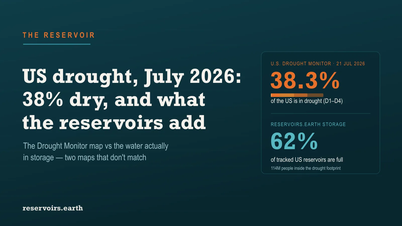
About 38% of the United States was in drought as of the U.S. Drought Monitor's 21 July 2026 reading — 45.8% of the Lower 48, an area home to roughly 114 million people, according to the U.S. Drought Monitor and Drought.gov. That is the official weekly map of where the country is dry. It is not the same map as where the country's water is short: across the roughly 515 major reservoirs we track, US storage is about 62% full, and the two pictures diverge in ways that matter. The Drought Monitor tells you where it is dry this week; reservoir levels tell you where the water bank has already been spent.
Key takeaways
- 38.3% of the US is in drought (D1–D4) as of 21 July 2026, per the U.S. Drought Monitor; a wider 55% is at least "abnormally dry." Roughly 114 million people live inside the drought footprint, and 45 states have some moderate drought or worse.
- It eased slightly, but only on average. National coverage fell about 1.5 points and the affected population about 3.9% from the previous week — a national number that hides sharp regional moves in both directions.
- The fastest deterioration is in the Northern Plains and Upper Midwest — the Dakotas, Minnesota, Wisconsin — where a hot, fast flash drought is spreading. Yet the region's big reservoirs are still 80%+ full: North Dakota ~80%, South Dakota ~82%, Montana ~85%. Storage lags the weather by months.
- The emptiest water bank is the Southwest, where the Monitor and the reservoirs agree. New Mexico's reservoirs are ~25% full, Nevada's ~28%, and the Colorado River's Lake Mead and Lake Powell sit at 25% and 22% — near record lows.
- The two maps measure different things. The Drought Monitor is driven by precipitation, soil moisture and streamflow — the short-to-medium term. Reservoir storage is the slow, managed indicator that shows the accumulated result. Reading them together is the whole point.
What the U.S. Drought Monitor actually is
The U.S. Drought Monitor (USDM) is a single national map, updated every week, that classifies the country into drought categories from D0 (abnormally dry) through D1 (moderate), D2 (severe), D3 (extreme) and D4 (exceptional). It is produced by the National Drought Mitigation Center at the University of Nebraska–Lincoln together with the U.S. Department of Agriculture and NOAA, released Thursday mornings and valid through the preceding Tuesday. Crucially, it is not a single instrument reading: it is a "convergence of evidence" synthesis — precipitation and the Standardized Precipitation Index, soil moisture, streamflow from USGS gauges, snowpack, groundwater, and input from a network of local experts — distilled into one categorical map.
That method is why the Monitor is a conditions map, weighted toward what has happened to the weather and the land surface in recent weeks to months. Reservoir storage is one of the hydrological inputs it considers, but it is a lagging one — which is exactly why a reservoir-level view adds something the headline drought percentage does not.
The national picture, as of 21 July 2026
The Monitor's categories are cumulative — each includes the more severe ones inside it. Here is the share of the United States in each band on the 21 July 2026 map:
| Category |
Share of the US |
| Abnormally dry or worse (D0–D4) |
55.0% |
| In drought (D1–D4) |
38.3% |
| Severe drought or worse (D2–D4) |
24.4% |
| Extreme drought or worse (D3–D4) |
9.0% |
| Exceptional drought (D4) |
0.8% |
About 114.1 million people live within the D1–D4 area, and 45 states have at least some moderate drought. Derived from those area figures, the national Drought Severity and Coverage Index (DSCI) works out to about 127 on its 0–500 scale, where 0 means no dryness anywhere and 500 means the entire country in exceptional drought. Week-on-week the footprint shrank by about 1.5 points — but that average is the sum of an improving East and a deteriorating northern tier.
Where it is getting worse: the Northern Plains flash drought
The clearest deterioration on the July map is across the Northern Plains and Upper Midwest — North Dakota, South Dakota, Minnesota and Wisconsin — where weeks of extreme heat and little rain have driven a flash drought: a drought that develops in weeks rather than seasons, parching topsoil and stressing crops fast. On the Drought Monitor, these states worsened even as the national number improved.
Now look at the same region's reservoirs, and the mismatch is instructive:
The reservoirs are still comfortably full while the Monitor flashes drought — because a flash drought hits the soil and the growing season long before it reaches a big managed reservoir. These reservoirs are buffered by months of banked snowmelt from the upper Missouri system and by controlled releases; it takes a sustained, multi-season deficit, not a hot July, to draw them down. This is the single most common way to misread a drought map: a state can be "in drought" and have full reservoirs at the same time, because one measures the current weather and the other measures the stored water behind it.
Where the water bank is already spent: the Southwest
The opposite case is the Southwest, where the Monitor and the reservoirs point the same way — and where the depletion is structural rather than sudden. New Mexico is the driest reservoir state we track at about 25% full, with Elephant Butte on the Rio Grande near empty; Nevada reads about 28%, and Utah about 32%. Those state numbers are dominated by the Colorado River's two giants — Lake Mead and Lake Powell, at 25% and 22% and both near record lows — the accumulated result of a two-decade drought on the basin, rationed by allocation and refilled only by Rocky Mountain snow.
This is the storage that a single week of the Drought Monitor cannot show you. Even in a week when the Southwest's conditions improve, its water bank stays near empty, because it was drawn down over years. It is also why Oregon and the Pacific Northwest, at about 30% reservoir storage, deserve more attention than their drought-map colour alone suggests. For the fuller version of which regions are actually closest to the edge, see our Day Zero watchlist.
How to read the two maps together
The Drought Monitor and a reservoir map are not competing answers to the same question — they answer two different questions, and the useful reading is the combination:
|
Reservoirs full |
Reservoirs low |
| In drought (USDM) |
Flash / agricultural drought — the Northern Plains now: dry weather, water still banked |
The dangerous quadrant — the Southwest: dry and the storage is gone |
| Not in drought (USDM) |
Secure — most of the wet East |
Managed draw-down or chronic deficit — full reservoirs released for power or supply, or a slow structural shortfall |
The one-line version, worth remembering: the U.S. Drought Monitor tells you where it is dry today; reservoir levels tell you where the water is already spent. A drought that shows up on the Monitor may never reach the reservoirs; a reservoir crisis like the Colorado's can persist through weeks the Monitor calls an improvement. Where you should worry most is where both agree — and in July 2026 that is the Southwest.
Sources: drought figures from the U.S. Drought Monitor (National Drought Mitigation Center, USDA and NOAA) and Drought.gov, 21 July 2026; reservoir figures are reservoirs.earth's own, from federal gauges as described in where reservoir data comes from. For the national reservoir picture see US reservoir levels and the driest states and the June edition on drought risk vs normal; how openly the US publishes its water data is scored on the Reservoir Transparency Index.